My Role
UX / UI Designer
Figma, Photoshop,
Illustrator
1 UX Designer
2 Product Owners
12 Developers
Team
2 weeks
Duration
Tools
Company
CloudSaver
Date
2023
Designing for Emptiness
What to do when the user has no content (yet)
Within an application, users can encounter empty states – spots meant for user data, but where none is available.
I believe in auto-filling the data for a user whenever possible, but sometimes there are scenarios where that can't happen.
We found four scenarios at CloudSaver where tools or pages had no initial user data. Our solution created a stylistic look and feel that our customers loved.
I was the sole UX person supporting a 12-person development team. We were a startup – and we worked at a very fast pace.
"Evolving" A Robust Financial Application
The earliest shipping version of CloudSaver had only two main applications.
Lots of Screens, Lots of Designs
Within a year we had a 20 applications, dozens of templates, hundreds of screens, and a Style Guide that needed adjusting as we encountered new requests and use cases.
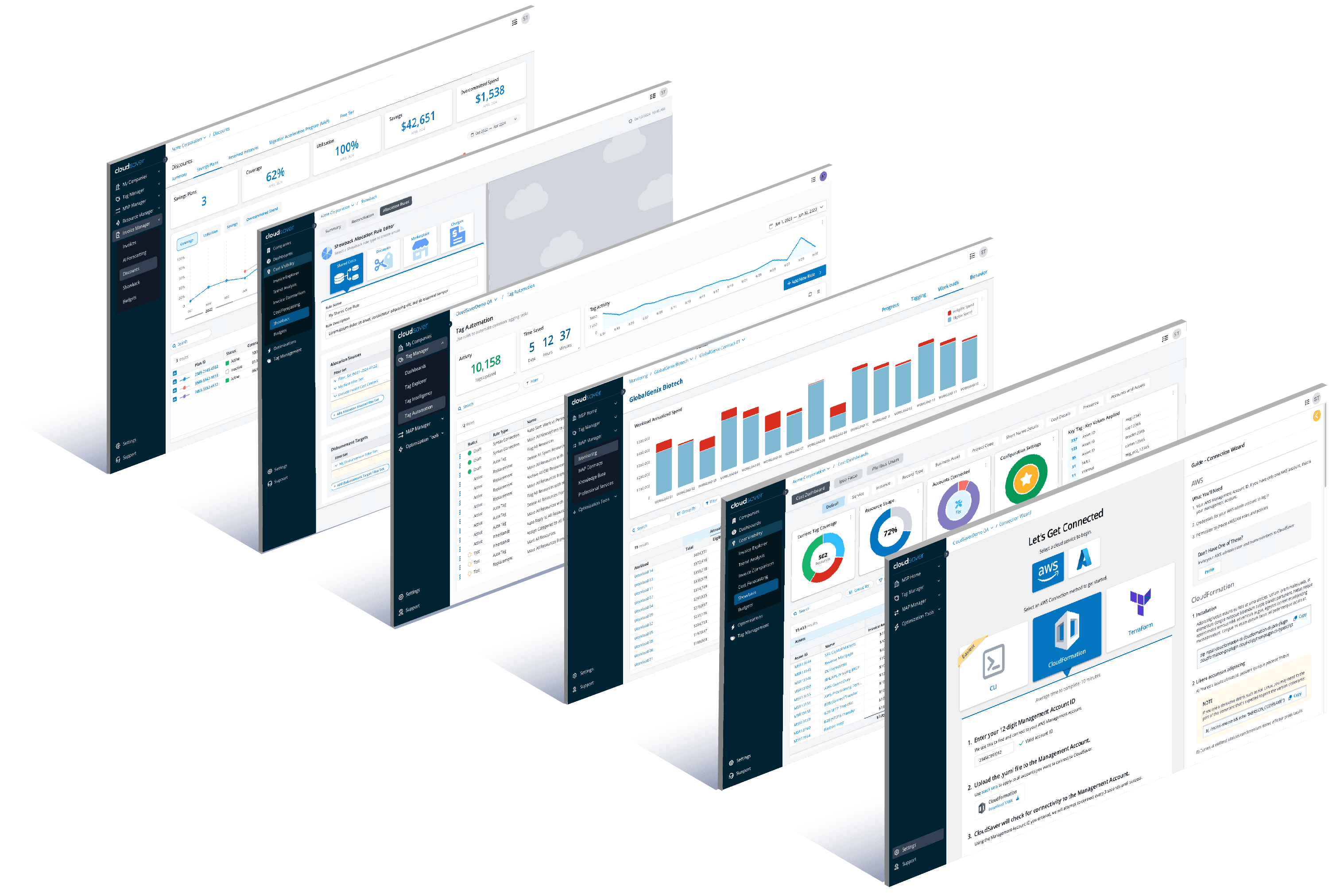
I have a lot of stories about these screens, but one unusual scenario occurred after we already had a robust suite of applications – with a tool called "Showback"
Showback is a financial term – it's an accounting method used for allocating costs across departments. This is the Showback summary dashboard (pictured below).
When I designed it, I was under the impression that if a client/customer were connected to our system, they'd be able to see their data. Reasonable, right? But for a number of technical reasons, this assumption was incorrect.
What should a new user see their first time here, if we can't show them their data?
Designing "Showback"
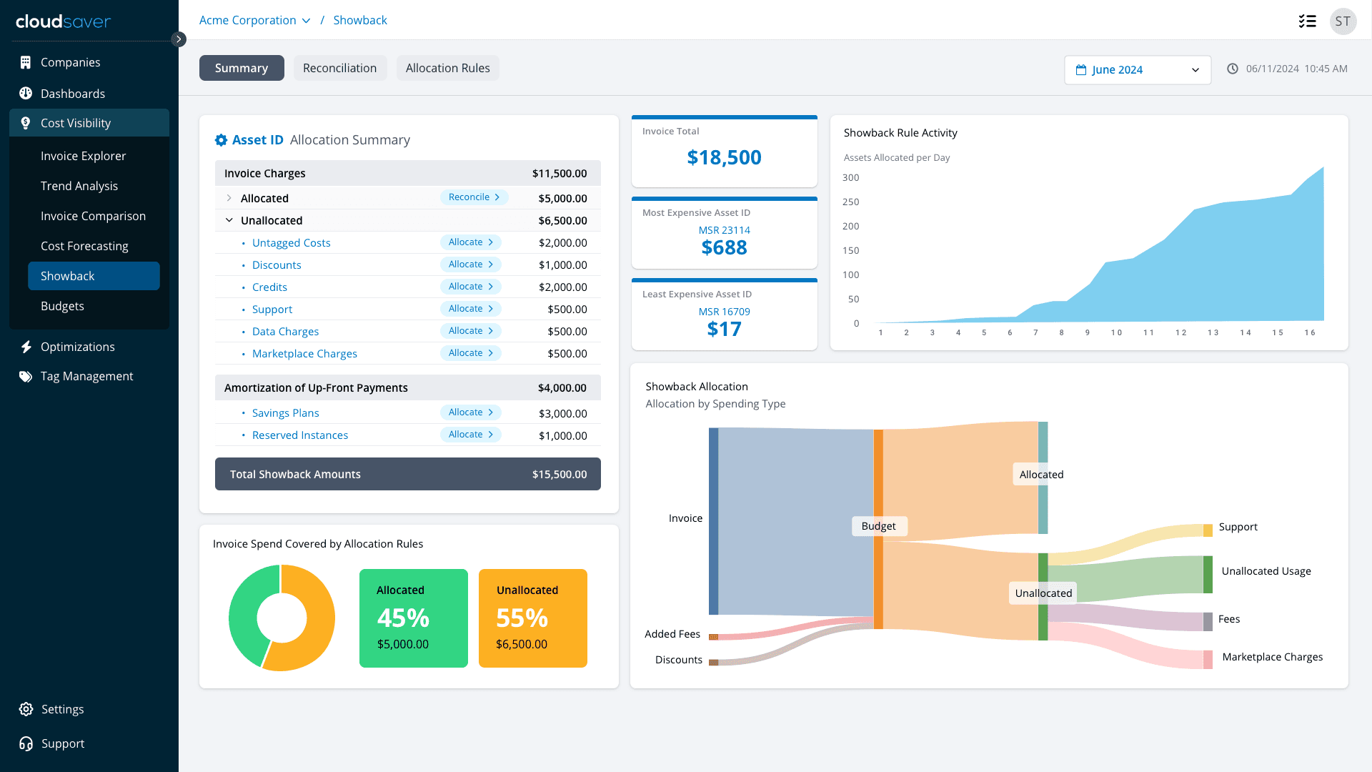
Which is Better?
Click to see our answer!
I mocked up two very different empty-state versions. We A/B tested them and I had follow-up conversations with a customer focus group. Which version do you think we went with?
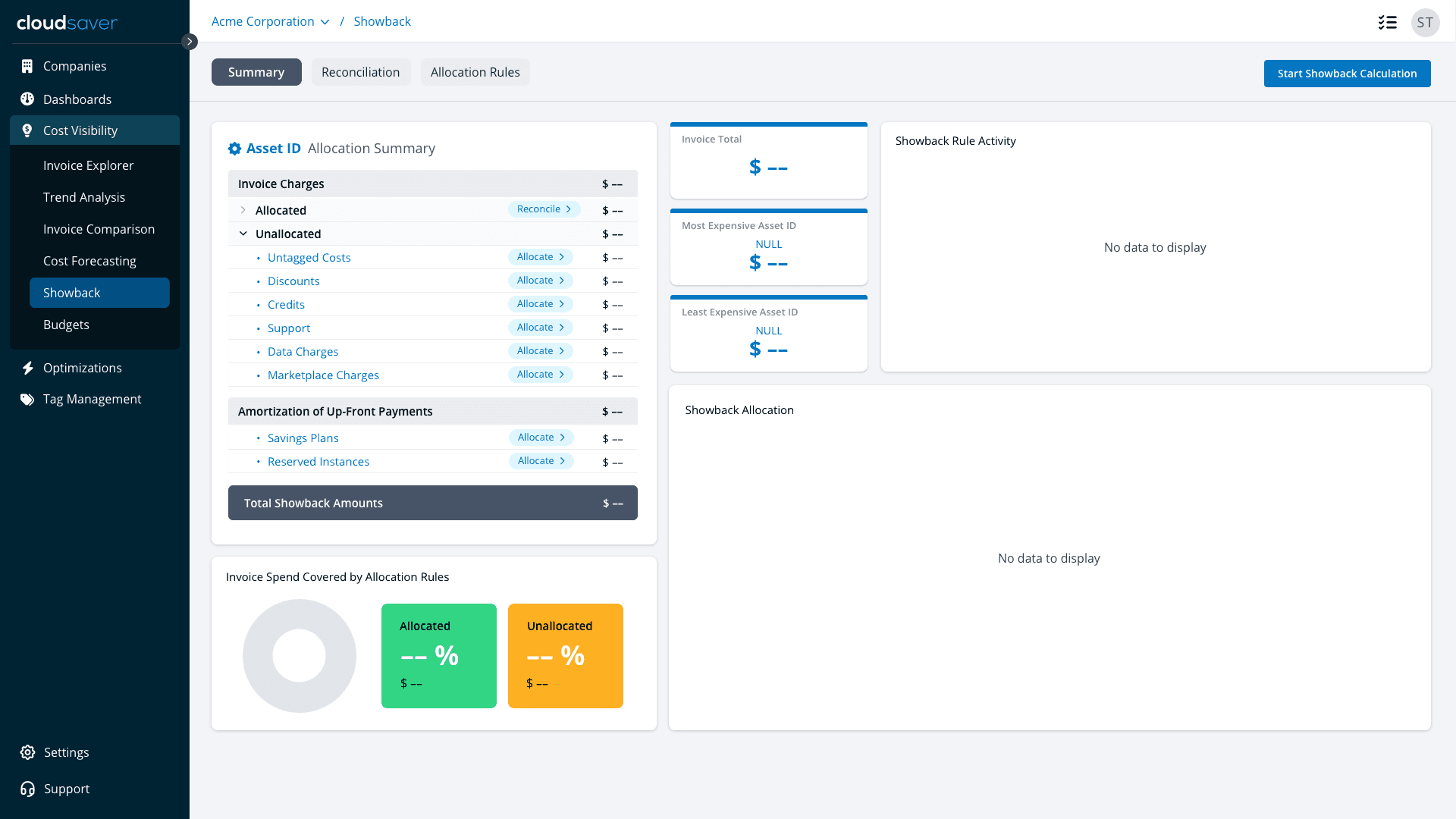
(A) An empty (no data) dashboard
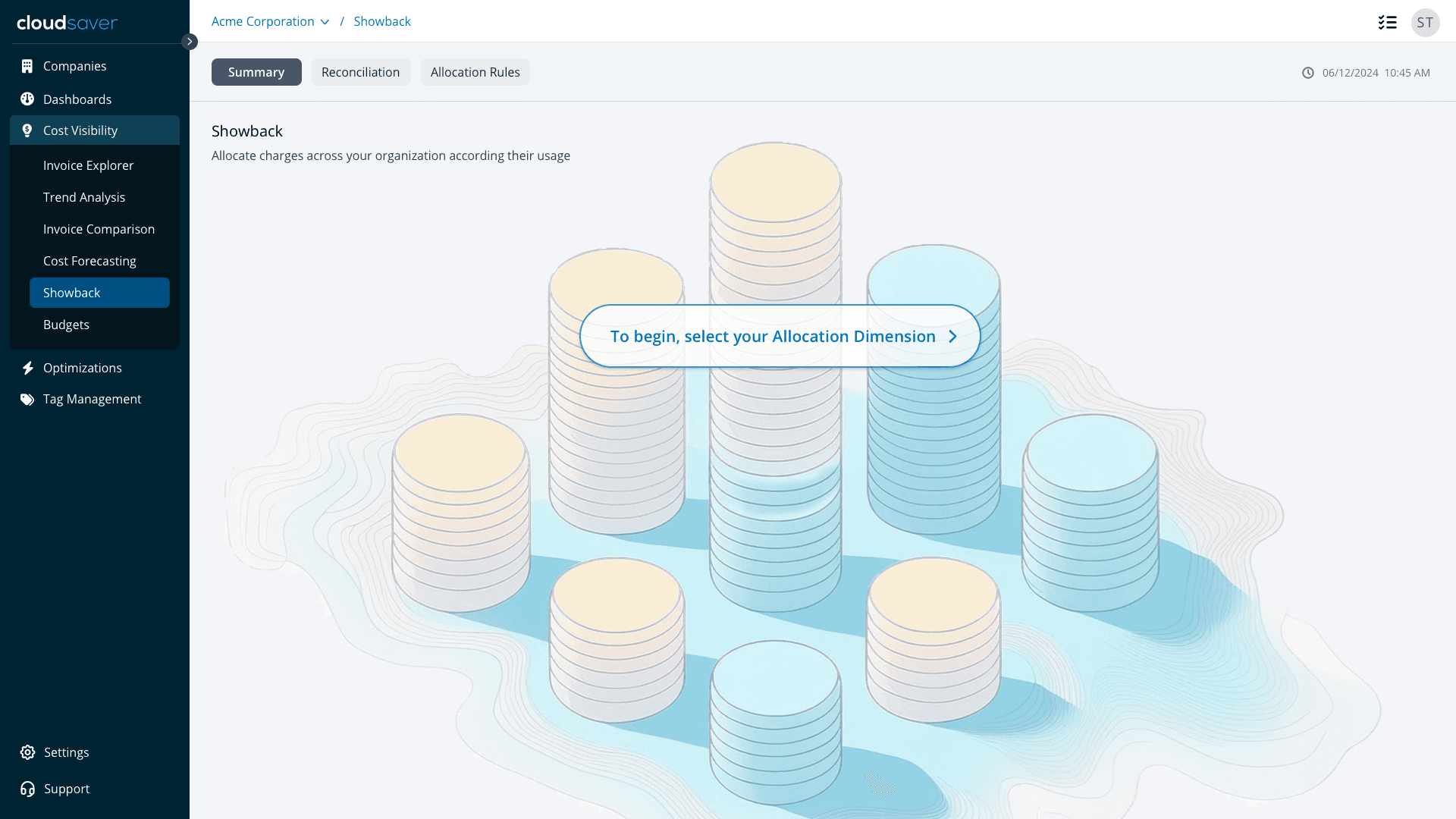
(B) An artsy page with a single call to action?
After we built Showback, we built a special AI program that examines a customer's cloud spending and forecasts their future usage/spending. Similar to Showback, pre-populating the forecast with data wasn't possible.
So again, what do we show in it's empty state to a new user?
Designing "AI Spend Forecast"
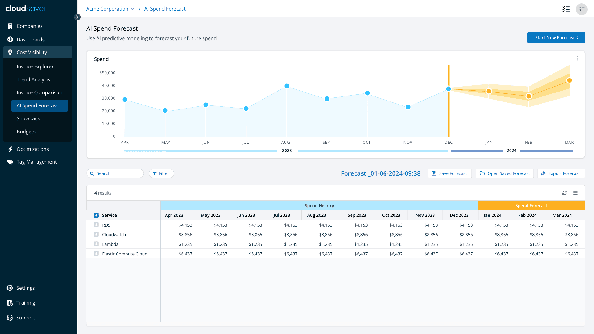
Which is Better? 2, the Sequel
Again, I've drafted two distinct versions of the empty state. Which do you think we went with?
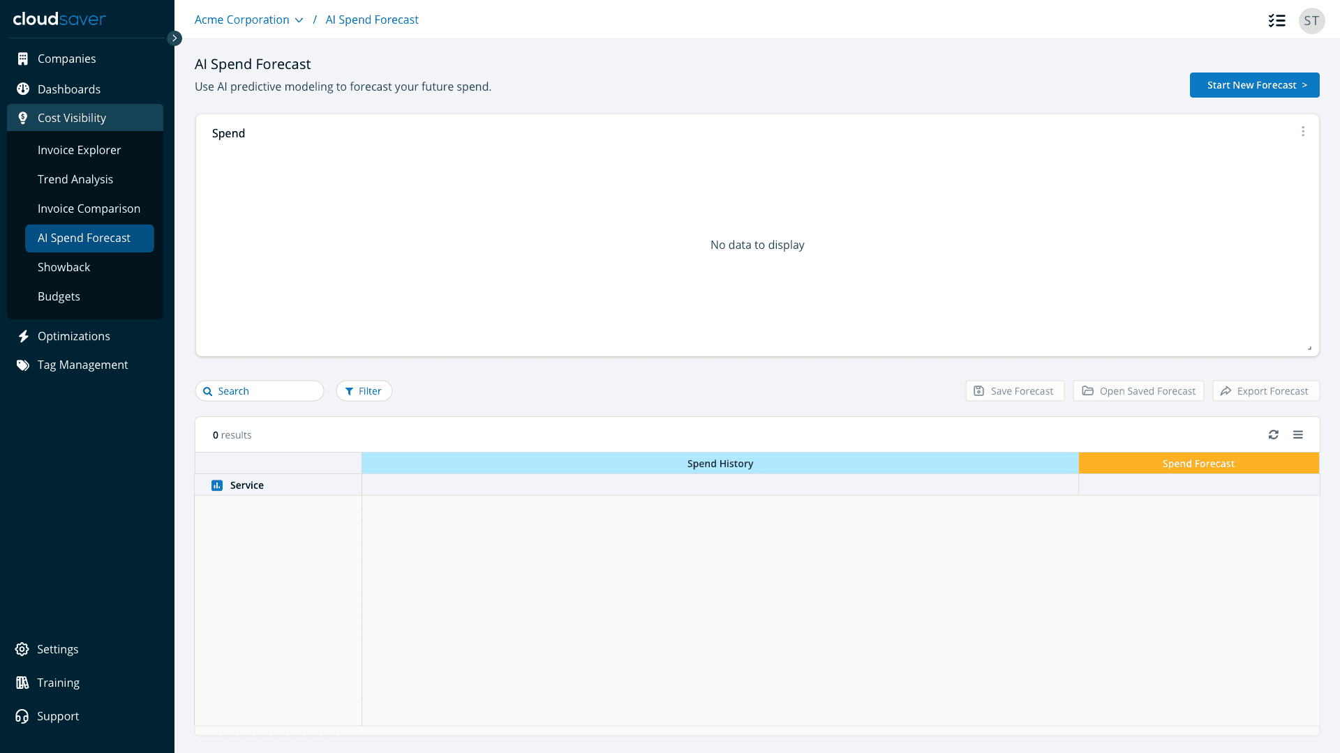
(A) An empty (no data) dashboard
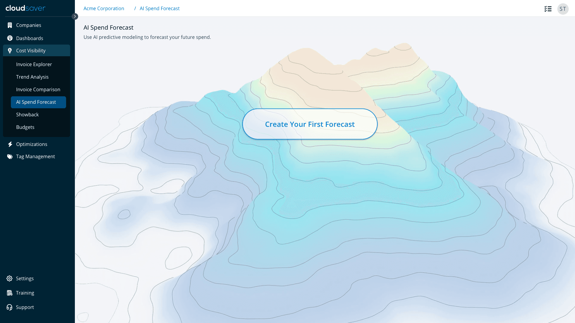
(B) An artsy page with a single call to action?
Click to see our answer!
Style Guides and visual languages work because people develop expectations for where things are on a screen and what they'll do. It's a shorthand for where they should look and what they should do next.
This scenario showed me that there are things which can "short circuit" a user's learned behaviors. But most importantly, that constraints can lead to design decisions that improve overall experience.
Conclusion
