My Role
UX
Fireworks, Balsalmiq, Axure
1 UX Designers
3 Clinicians
3 Analysts
5 months
Duration
Team
Tools
Company
Cerner
Date
2012-2013
Complicated Medical UX
By law, every hospital in the U.S. had to start defining their diagnoses using ICD-10, (the International Classification of Disease - 10th edition). It’s a worldwide standard. It’s complicated. The U.S. was scheduled to switch over in 2013.
In 2012, Cerner’s systems were used by about 30% of all U.S. hospitals. About 100,000 doctors would start using a new yet-to-be-built Cerner tool to look up and log all diagnoses.
According to my boss, if it were slow, or if it led to errors, then people could die. She then handed the design of this tool to me.
A Quick Background on ICD-10
There are about 69,000 ICD-10 codes. Think of it like a Dewey Decimal System, but for things that can send you to a hospital.


This is a real ICD-10 code!
*
*
All of the codes are very specific. They are used to gather data to help identify larger trends or hazards in a population. For example, because of ICD-10 diagnoses, we can discover that lead poisoning is dramatically higher in a few cities, which leads investigators to look for old lead pipes that might still be used in a community.
A few of the codes sound (and probably are) absurd, like the vampire one. Or the one about being burned by water skis while jumping through a fire hoop during a performance – V91.07: A burn caused by water skis on fire
The Task
In the new system, doctors would need to make MANY new additional choices.
Wrist Fracture
S62.011B - Displaced fracture of distal pole of navicular [scaphoid] bone of right wrist, initial encounter for open fracture
OLD
NEW
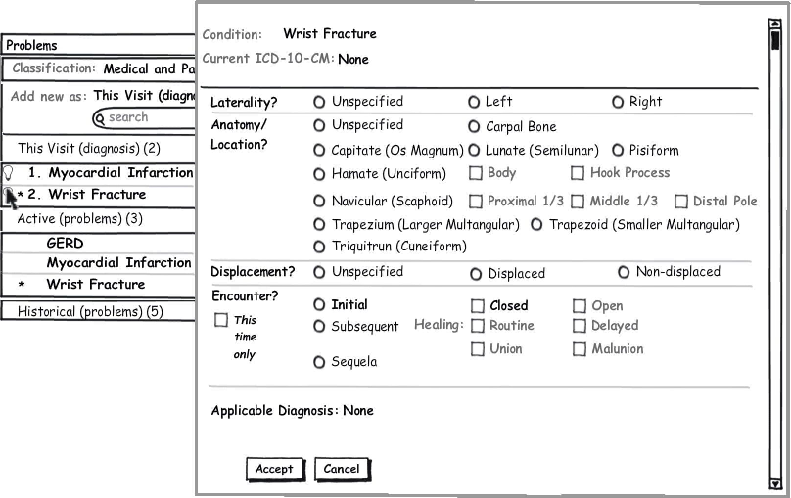
The Cerner doctor assigned to my project had come up with this wireframe on his own to show clients. “It’s like search on the iPhone,” he said.
I had to make a faster, better way to do this.
Wrist
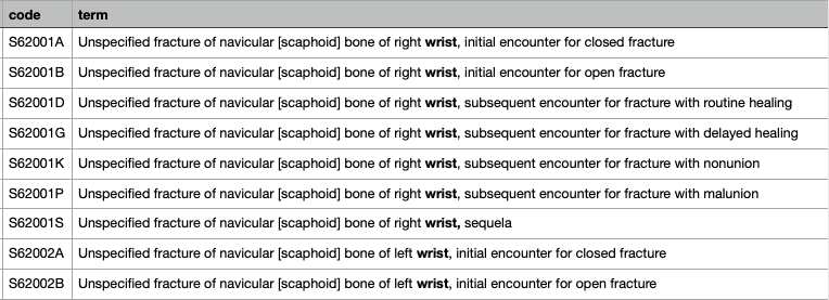
It used type ahead for long lists. They all HATED it. The resounding feedback was that something that used to take a fraction of a second would now a minute, or longer.
Content + User Goals = UI
In the new system, doctors would need to make MANY new additional choices.
I spent a day with the team white boarding. We focused on the content's Information Architecture. I saw that it was Controlled Taxonomy - every ICD-10 code fit in a category. From there we brainstormed ways to use that to make finding a code faster and easier.
EVERY “VARIABLE” FIT INTO ONE OF THESE CATEGORIES
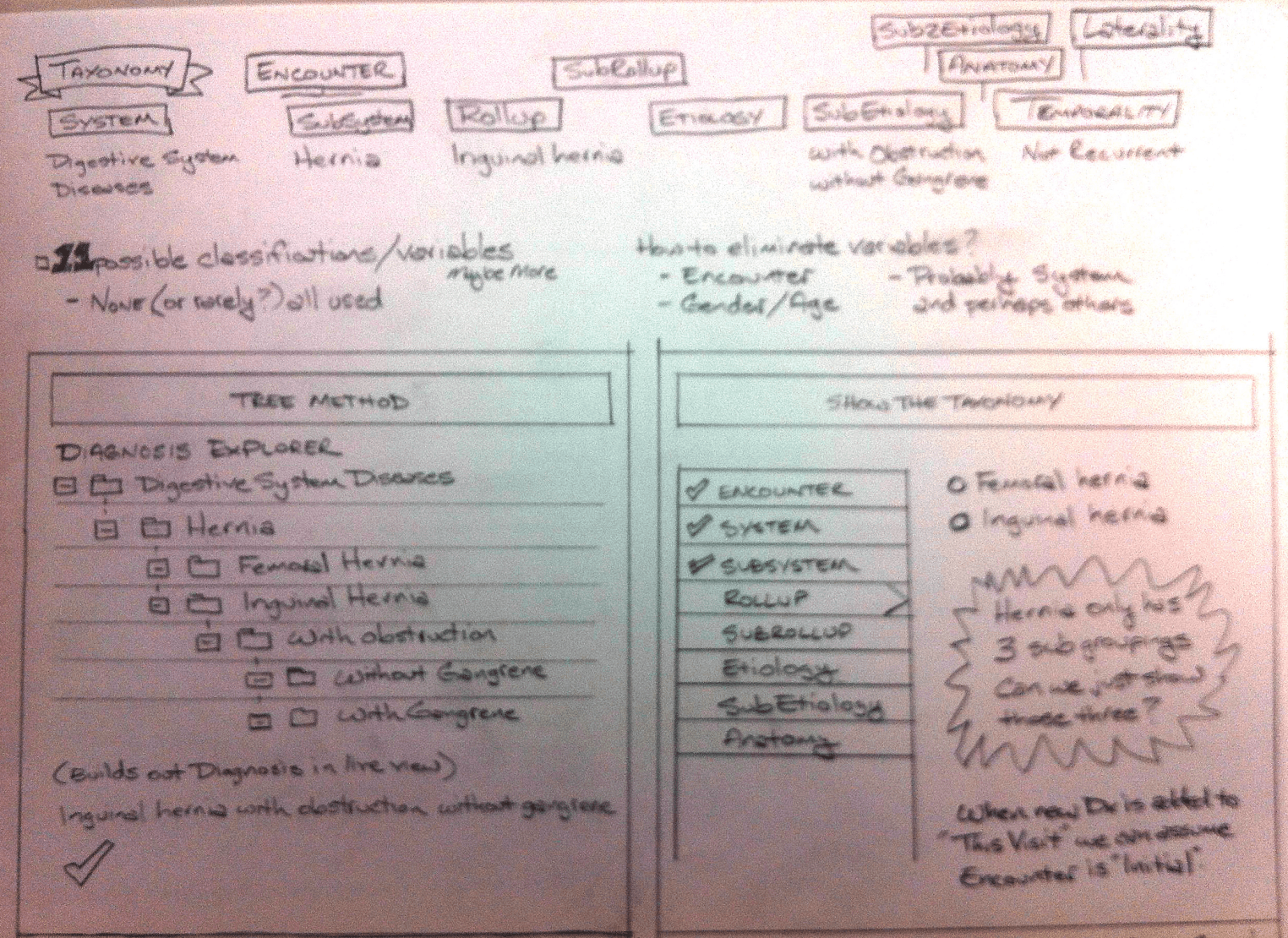
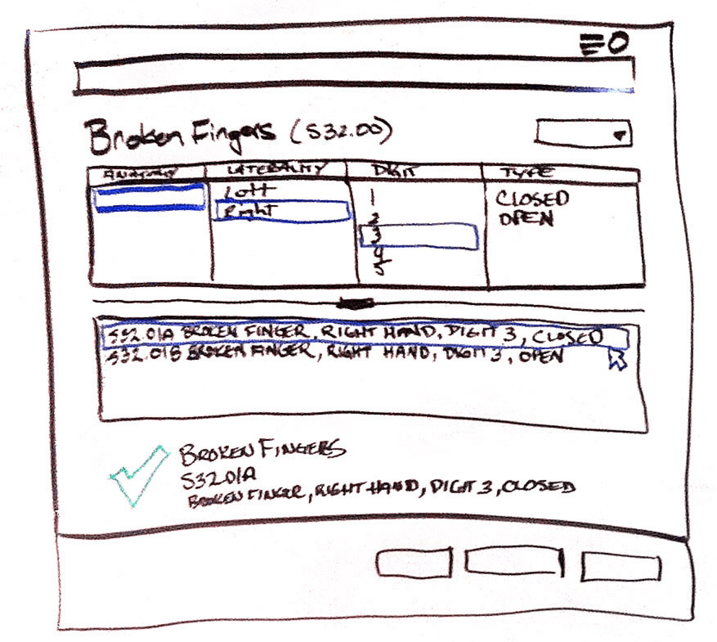
Over the next few days I worked through whiteboard scenarios with the team. Our Tree became a series of dropdown menus, which could be visually scanned faster.
Evolving the UI
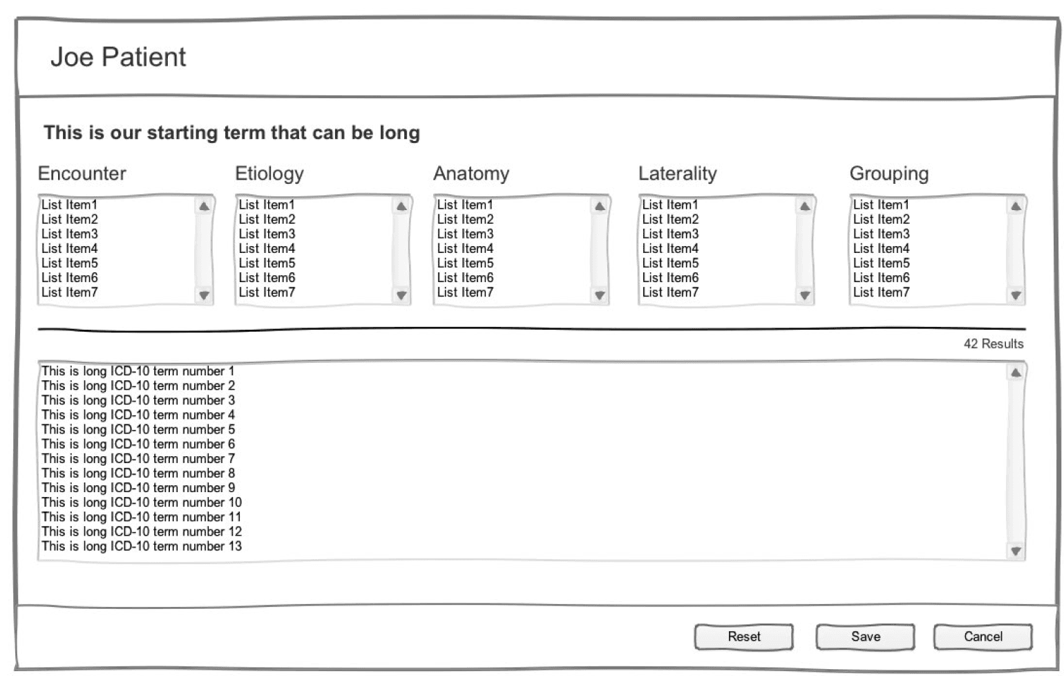
We came up with two UI possibilities that day – a Tree Method and a work list.
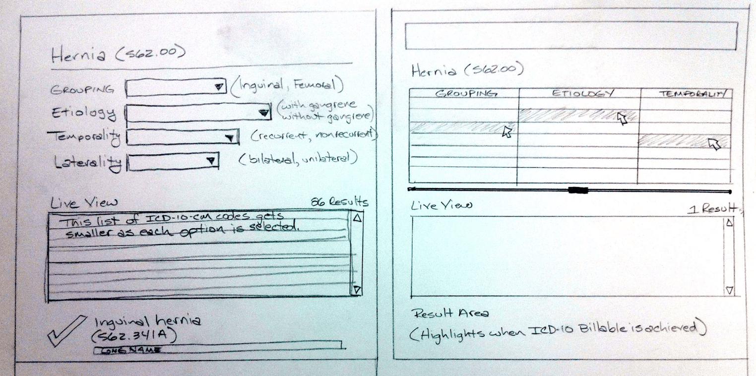
Drop Down Menus - only 5-7 options
Lets you see a Live Preview
Horizontal Lists of Short Menus - faster because you don’t need to click to open a menu to see options
Conflict Within the Team
The doctor assigned to our team disagreed with the rest of the team. He wanted something with a lot of choices “like TurboTax,” he said. And “what if doctors want to enter multiple dignoses?” The developers said this probably wasn’t feasible.
I believed it’d increase cognitive load. He insisted. So I worked with him to create a Balsalmiq mockup. And we ran his version through user testing. So we had a baseline for a performance to beat.
The “Turbotax” Option - would pop open after typing in the simple diagnosis that doctors were used to.
We took the Doctor’s advice that physicians would want to enter multiple proplems. So we developed a modal window that gives the option to Save/OK or to “Add Another”
Determining When We Were Ready to Move On
The team was satisified that we had satisfied all of our UX User Stories, which was a list that I maintainedas the UX person on the team. We arrived at a UI framework that we wanted to build out.
Ready to Test
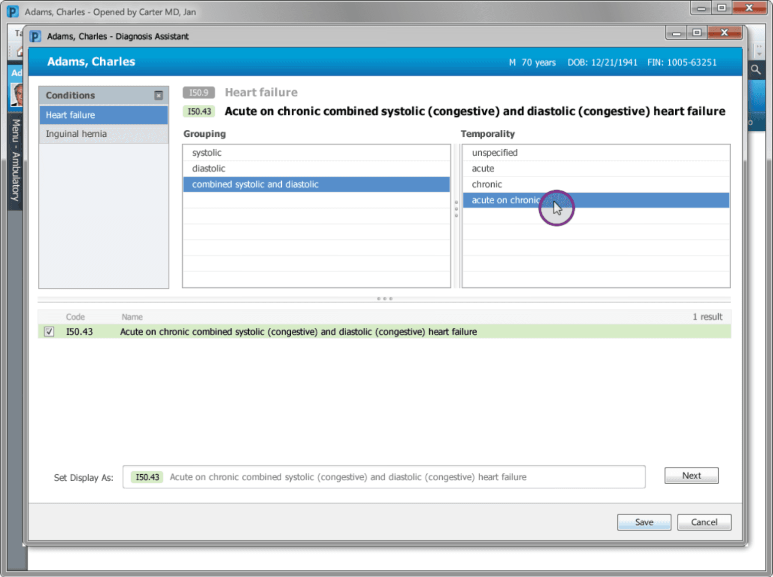
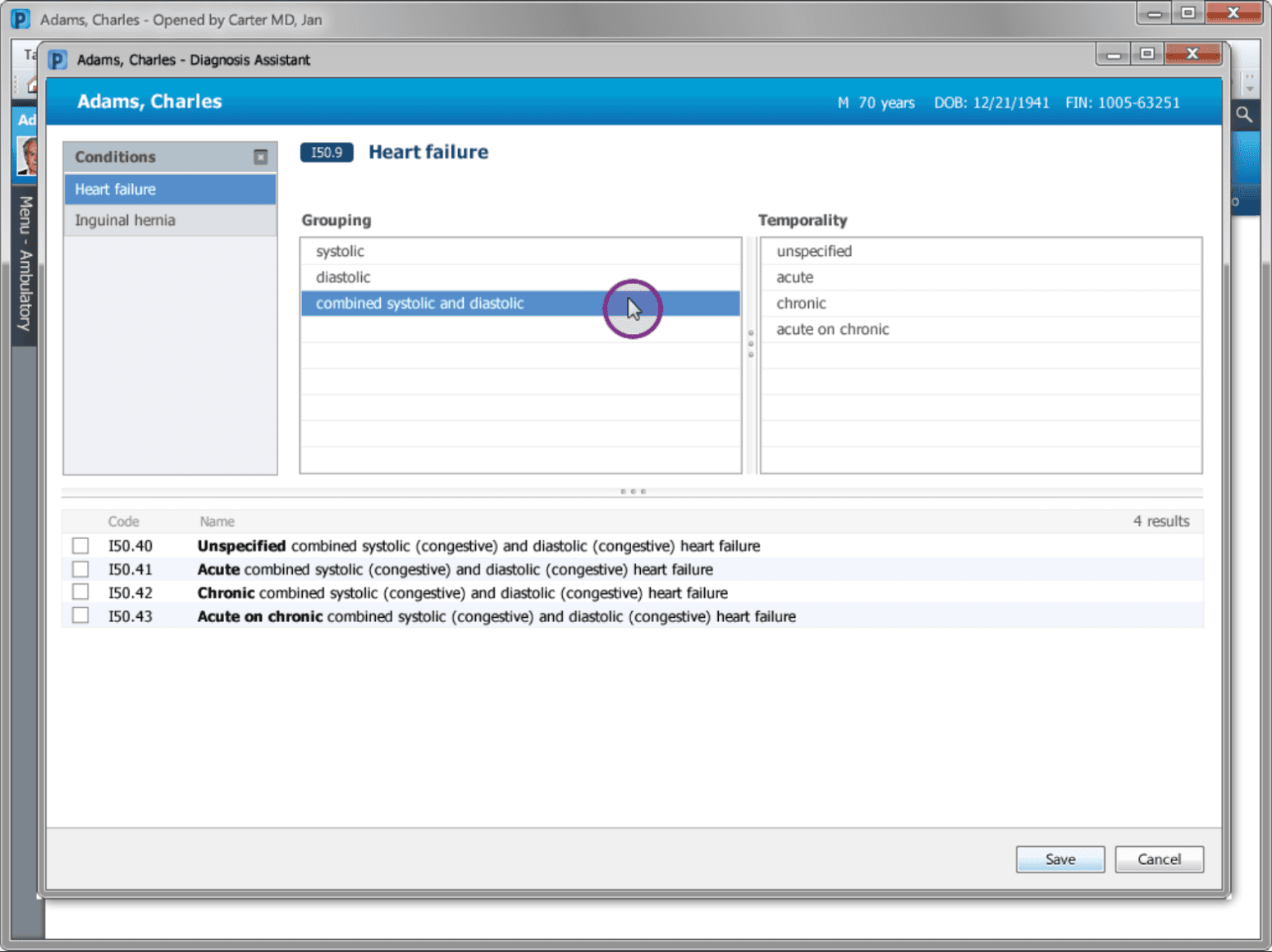
We built two common medical scenarios (Heart Failure and Hernia) and created all of the possible screens to create a clickable prototype. In most cases, the number of medical option menus was only two or three!
The speed was amazing. A doctor could enter Heart Failure and in three clicks they’d have an ICD-10 diagnosis. It handily beat the “TurboTax” version.
The Result
Our tool was called “Diagnosis Assistant” by Marketing. It’s one of the main selling points for Cerner and is often shown side by side against competitors for it’s speed, accuracy and ease of use.
As of 2022, it’s still used in hospitals, including Adventist Health Systems in Overland Park which I got to see when I broke my arm riding an electric scooter. 😂
V00.838A Initial encounter for other accident with a motorized mobility scooter
S52.022A: Displaced fracture of the olecranon process in the left elbow
