My Role
UX / UI Design
UX Research
Figma, Photoshop,
Illustrator
1 UX Designer
+Stakeholders
6 months
Duration
Tools
Team
Company
Amazon
Date
2022
A High-Visibility Mobile Redesign for Amazon
Using research and business goals to shape design
Amazon's warehouses are fast-paced and everything is measured for efficiency. Needing glasses to see a handheld mobile screen can mean a huge difference when multiplied across a million employees.
Amazon suspected that a UI redesign could save time, increase safety and improve the bottom line. They just needed someone to research, build, and test it – me.
That’s it!
My job description was astonishingly brief. I was hired for a six-month contract to accomplish this one sentence.
The stakeholders wanted to deliver a presentation at an annual meeting to get approval and funding for an initiative to make a handheld computer's UI better.
My first task was to lay out to the stakeholders how we should accomplish this. I proposed UX research, employee interviews, and real-world UI prototyping that would be necessary for a presentation to convincingly persuade their decision makers.
What I Was Hired To Do
Assist in putting together a presentation to update the UI for a warehouse mobile device.
“
Amazon operates 110 giant warehouses in the US. They employ up to 1.2 million workers, depending on the time of year.
As of 2022, the median age of an Amazon warehouse worker was 38.9 years old. Over the next 20 years, the US population (and Amazon workers) are also expected to get older.
According to medical professionals, a majority of people start to need reading eyeglasses at around 40 years old. So very soon an increasing majority of warehouse workers will need to wear glasses to perform their tasks.
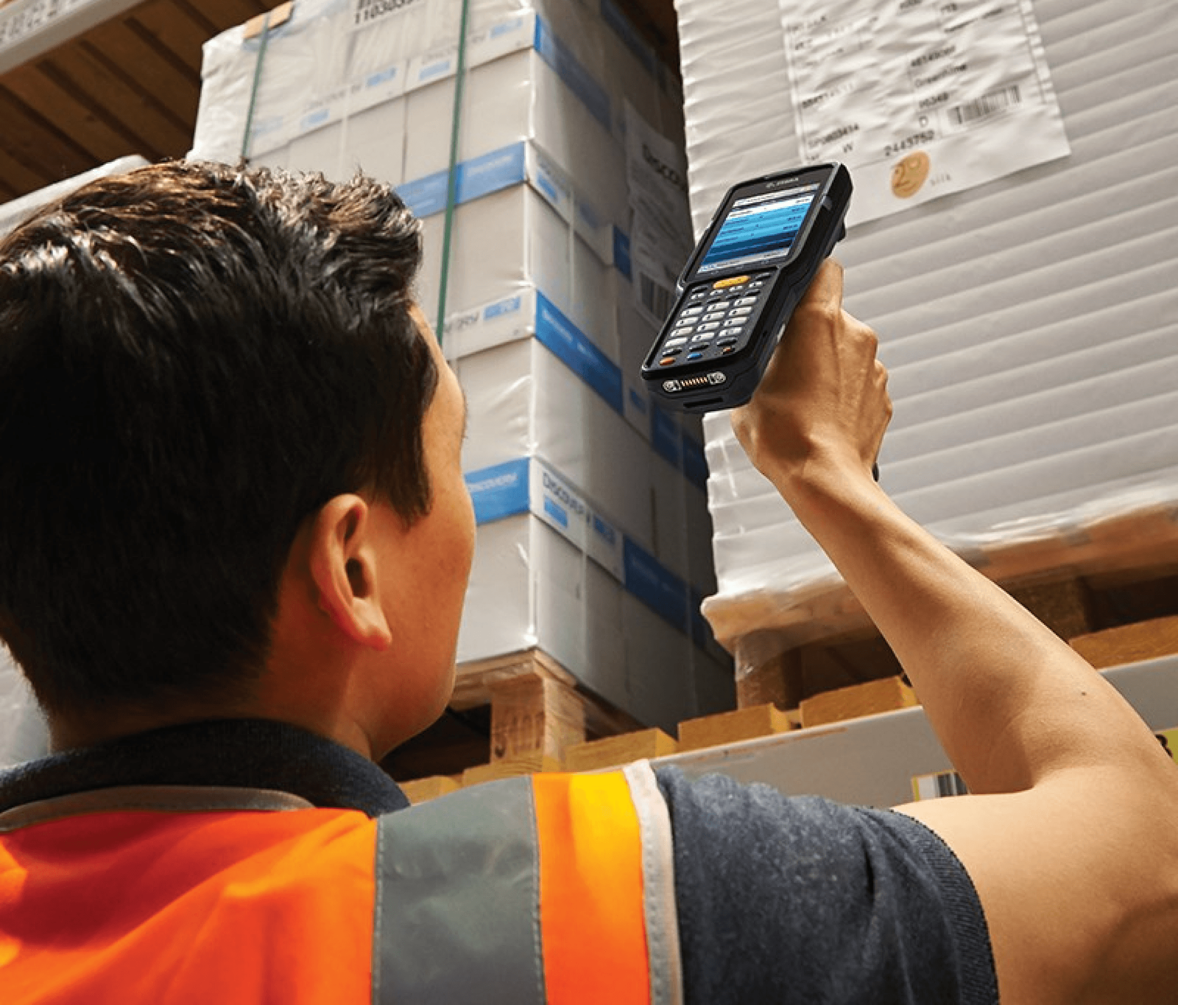
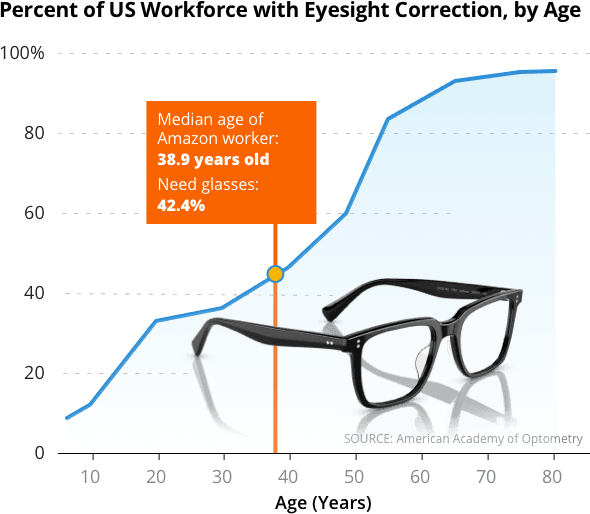
The Zebra MC 3300 “laser gun” is the workhorse utility for every Amazon warehouse worker, scanning every package and container.
Amazon’s internal Process Improvement Team note that warehouse workers who repetitively put on and then take off their reading glasses – up to 1.8 times per minute – slow down the overall speed of warehouse operations and it increases their error rate.
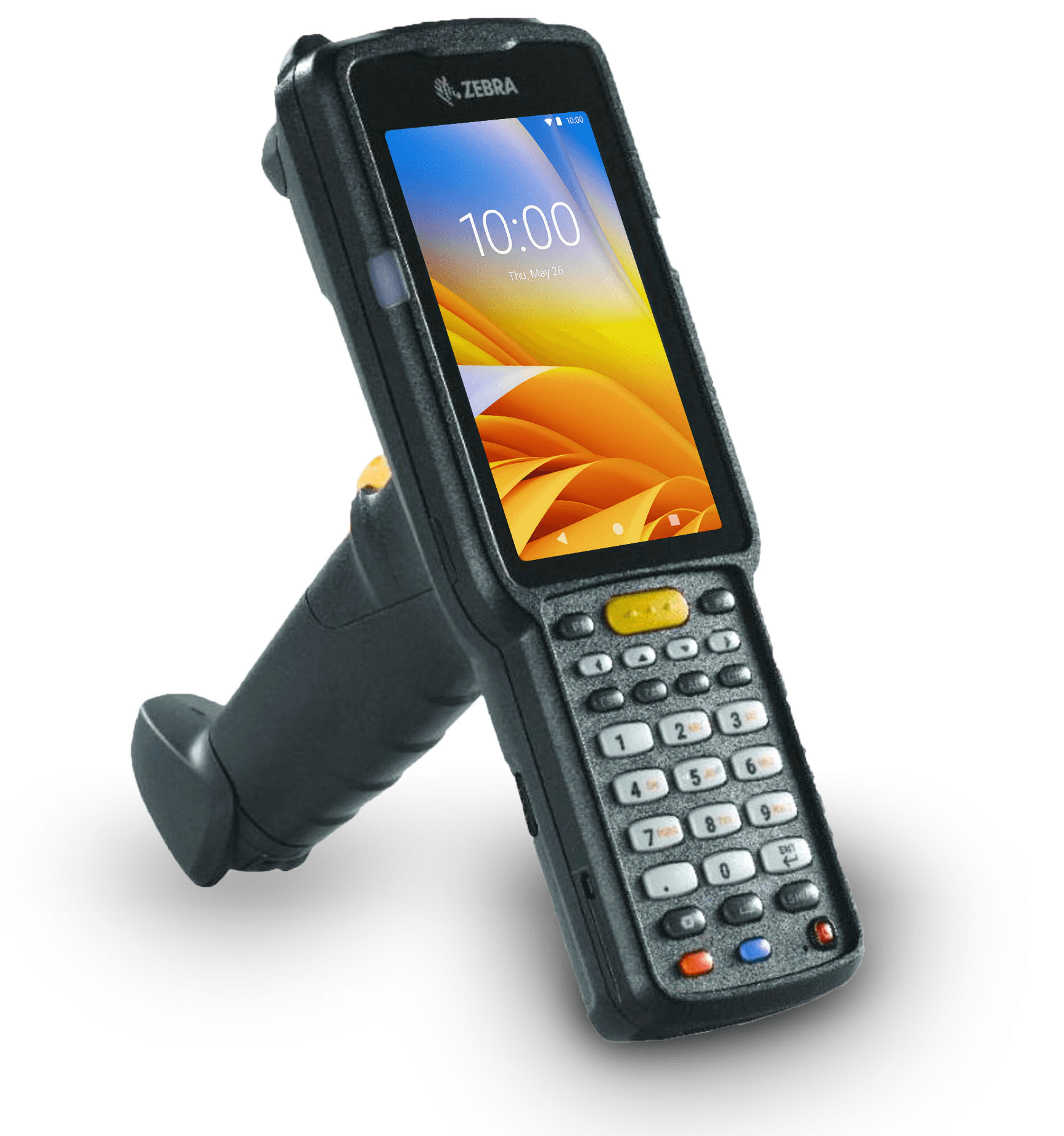
Amazon warehouse workers use a portable
laser-scanning handheld mobile computer to scan and track every box, package, and pallet that Amazon uses – the Zebra MC 3300.
It has a 4-inch display screen with a resolution
of 480 x 800 pixels.
Improving the UI and readability of these devices
increases efficiency and improves the bottom line.
It is VERY DIFFICULT for almost half of Amazon workers to read the data on these very important, mission critical, handheld “laser guns” without glasses.
The Situation
What Success Looks Like
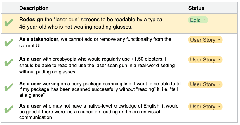
I developed and wrote Epics and User Stories and Acceptance Criteria for this project to help the stakeholders know what needed to be accomplished.
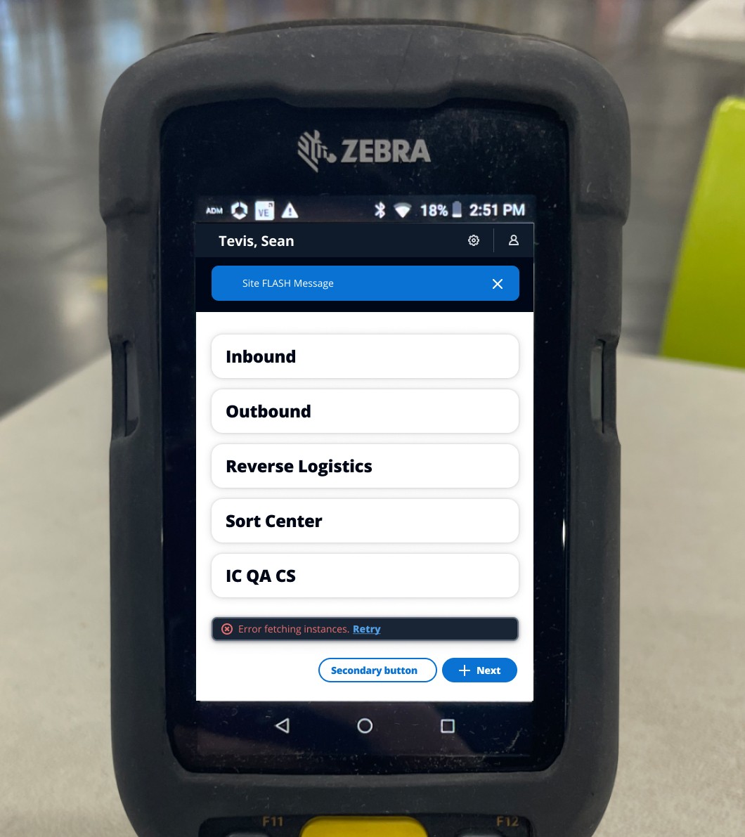
The Initial Design – A Failure!
Amazon has their own design system, called CloudScape.
CloudScape is responsive and there's a mobile view. I suggested we use that because the team that would need to support and maintain this project would be familiar with it. The stakeholders agreed. So, I mocked up our sample workflow.
It was TERRIBLE. At least for our purposes.
In the floodlights in a warehouse the contrasts blow out detail because there are too many fine lines or shadows. The reversed text is unreadable. And while working you can't tell at a glance one screen from another, because there is no color or tone variation.
I was thinking about how to perform tests in order to show the stakeholder team quantitatively that CloudScape was a going to fail our needs, but they all saw it immediately, too. So they just told me "come up with something that works."
On-Site Research
I went through a 12-hour warehouse training and spent three days doing scanning work using the "laser gun" to learn how it works and what might make it better. I talked to many, many employees and got their feedback.
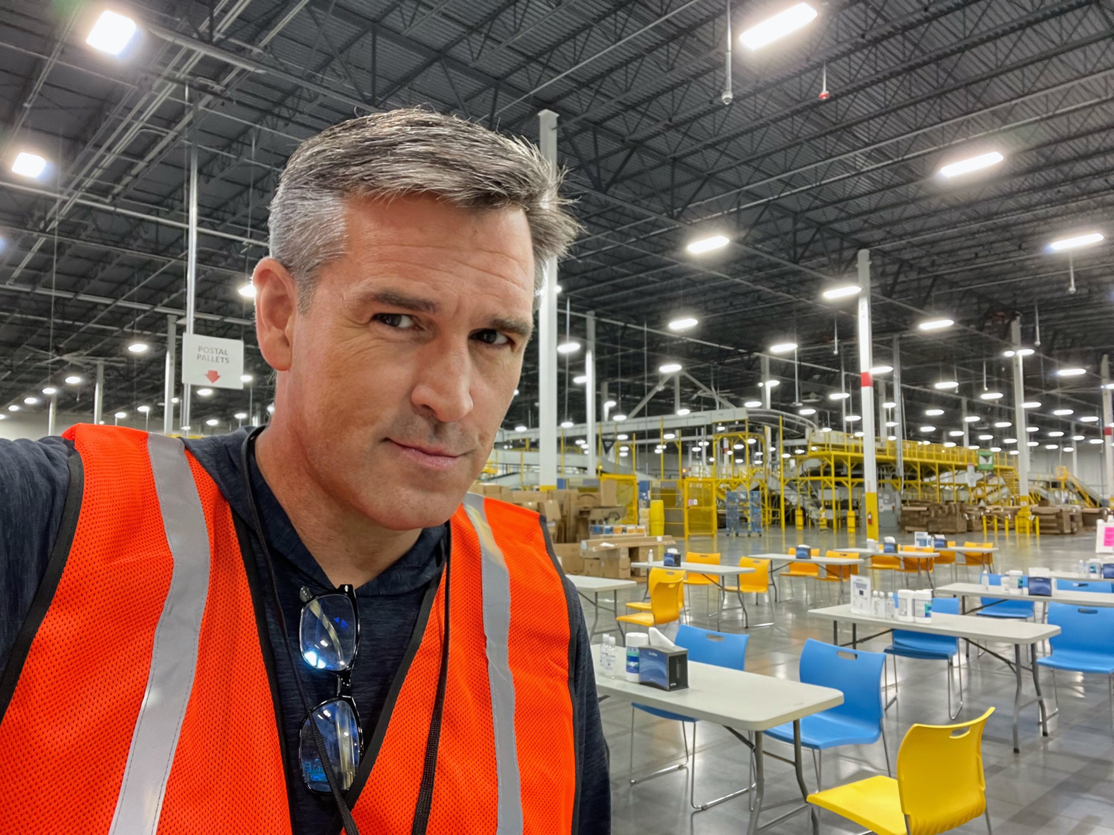
Me
I used feedback from workers who seemed to be able to provide helpful critiques and ideas for the project. A few had a lot of ideas and were very helpful.
We ended up with a design that was inspired by Street signs and Billboards.
When you're driving at 60 mph, you don't have the time to read a lot of text, so billboards have few words, big images, and communicate quickly.
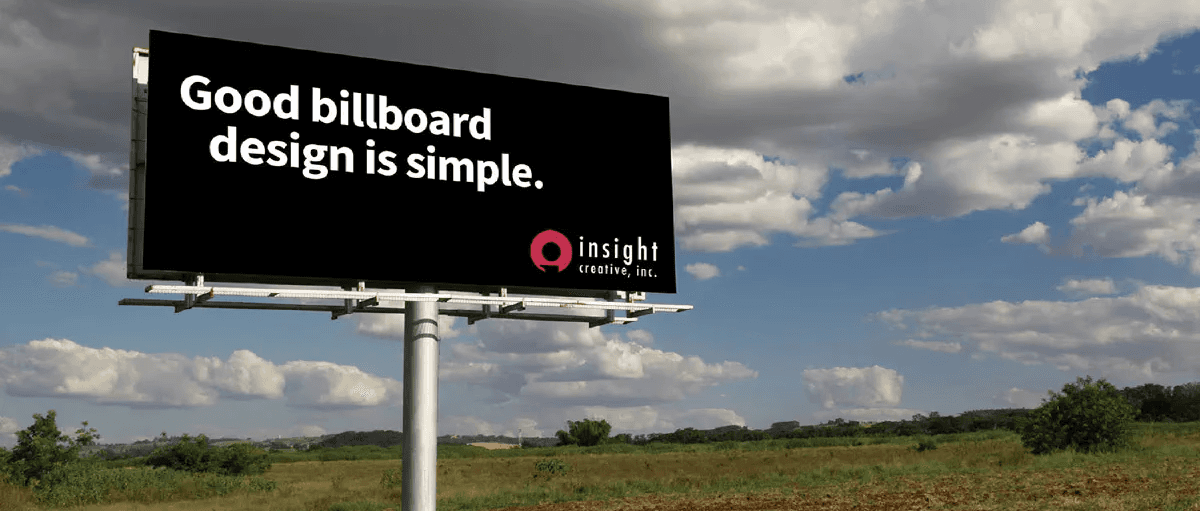


Street signs are recognized, rather than read.
We see the colors - yellow, red, green, blue and know instinctively what the sign is. Or if you're color blind, you recognize the shapes, too, for added context.
It was with this in mind I created the Amazon Warehouse Design System. A person who needs +1.5 diopters can tell what a screen is at arm's length – all while moving at full speed. They can tell when a new package is ready to be scanned, if the scan was successful or not, and when the "MOVE" was complete – all based (mostly) on color and shape.
Can you identify these street signs by shape and color?
Before
This is the super-simple workflow, used as the baseline to compare and demonstrate redesign elements to stakeholders.
A user logs in.
They select their role/application. In this case, they select "Inbound" which means they are scanning packages as they arrive.
They then scan a destination pallet where the package goes.
They then log back out.
After
This version was close to the final that made it into the presentation. It features:
• WCAG 2.2 Accessibility Compliance
• Big, visible, color coding so that you can
see a status at an arms reach glance ->
yellow = action needed
green = success
cyan/blue = info
• Removed extraneous detail
whenever possible
• Kept key number short codes
• plus many more
Conclusion
The final presentation was presented at Amazon's Growth Week in 2023. It featured 8 major workflows with more than 160 screens. It included the results of my UX testing which demonstrated in video testimonials that someone with +1.5 diopters could work without needing to put on their glasses.
The project was a success! And it was budgeted for FY2024.
I'd like to thanks all of the really great warehouse workers whose thoughtful feedback made this project succeed.
